Concept · Brand identity

Sightline

See the whole site. A brand built in a day, with AI in the loop — and the direction made by a person.

Role
Brand identity + AI direction
Type
Self-initiated concept
Sector
AI field-vision, SaaS
Made in
One day, AI-native
The brief

I gave myself the brief I'd give a client, then built the whole identity in an afternoon.

Sightline is invented: an AI that watches jobsite and field footage and flags what matters — a missing tie-off, a blocked exit, work that's actually done. The point of the exercise wasn't to prove AI can make logos. It was to show what still needs a person: the brief, the concept, the restraint, and every call about what to keep and what to throw away. AI moved fast. I decided. Here's the system, and the decisions inside it.

The mark

One letter, engineered.

Every vision startup reaches for an eye or a lens. Sightline's mark goes the other way: a hard-edged S cut into a hexagon, with its middle stroke pulled out as a single orange bar — the sightline. Structure first, symbol second. It holds from a hard-hat sticker down to a favicon.

The orange sightline is the one place signal appears — everything else is structural. It works in two colors or one: knock the middle out to white and the mark still reads. At favicon size the detail collapses and the whole S goes solid orange, so it never turns to mud.

Sightline
Sightline
MarkOne-colorLockupOn dark
Color

One signal on a calm base.

Field-safety brands default to hazard-cone orange on black. I pulled the orange back to a single accent — a point of focus, not a warning — sitting on a confident graphite so the system reads as trusted infrastructure. Lime handles live detection states only.

Graphite
#10161D
Base ink, dark surfaces
Signal
#FF5A1F
Primary accent · focus
Detection
#C8F24A
Live scan states only
Steel
#5B6B7A
Secondary · resolved
Fog
#E9E7E1
Neutral fields
Paper
#F6F5F2
Light surfaces
Type

Engineered, not decorated.

Clash Grotesk carries the brand — a grotesque with flat, cut terminals that echo the angular mark, set heavy for the wordmark and headlines. Geist runs the long text. Two faces, no flourishes.

Display · UI
Aa
Clash Grotesk Semibold
Uppercase & lowercase · tabular numbers 0123456789
Text
Aa
Geist
Body copy, documentation, and the fine print that keeps a jobsite honest.
In use

A system, not a logo.

The identity has to survive contact with the product — a phone in a gloved hand, a dashboard at 7am, a sticker on a hard hat.
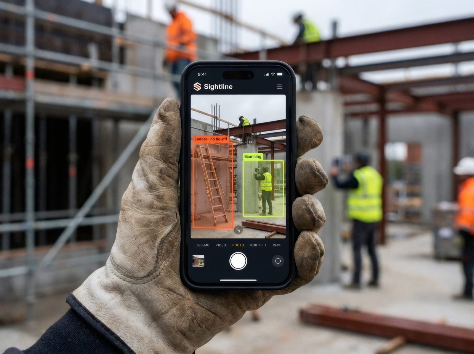
Sightline iOS field-capture app running on a phone held in a work glove, with orange and lime detection boxes flagging a ladder and a scanned workerField capture · iOS
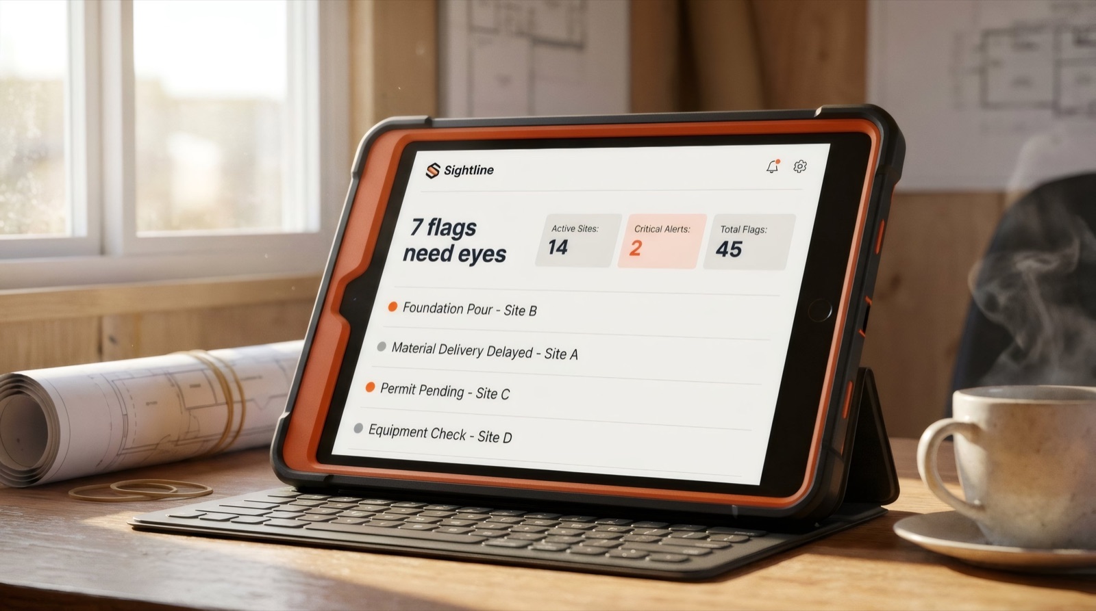
Sightline web dashboard on a rugged tablet in an orange case, headline reading seven flags need eyes with site statsWeb · dashboard
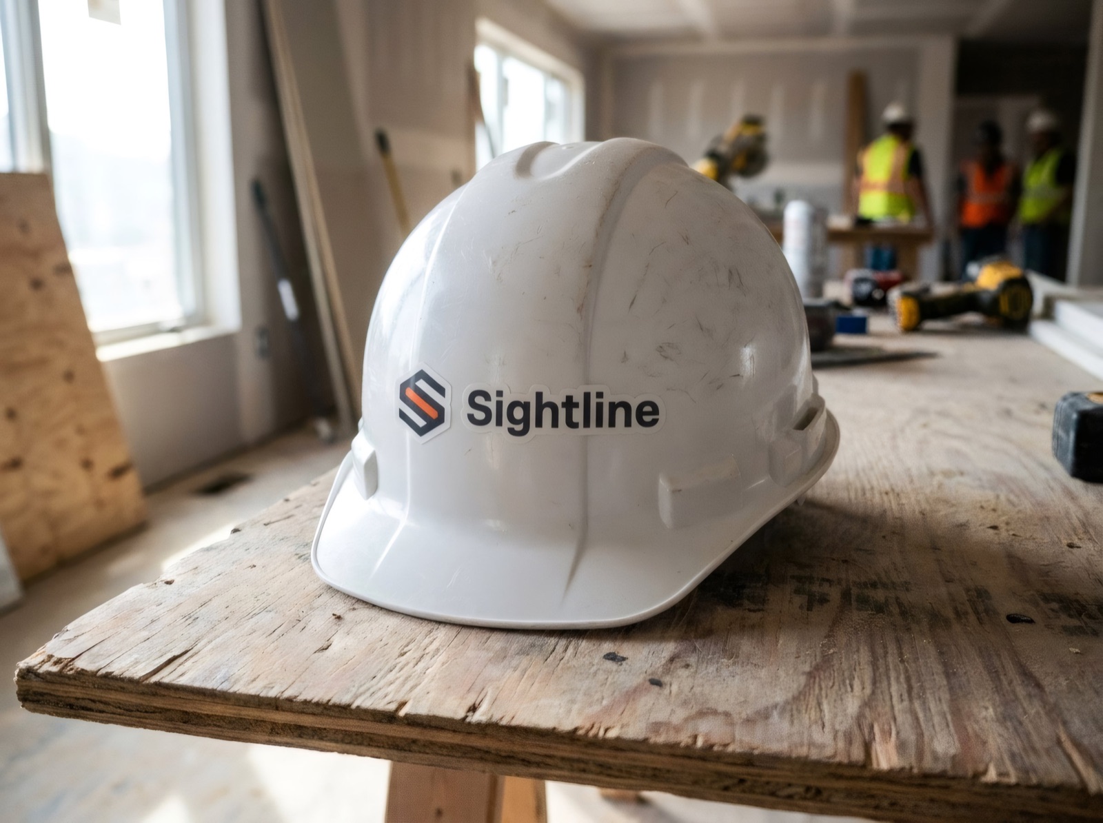
Sightline logo sticker on a white hard hat resting on a plywood table at a jobsiteSticker · hard hat
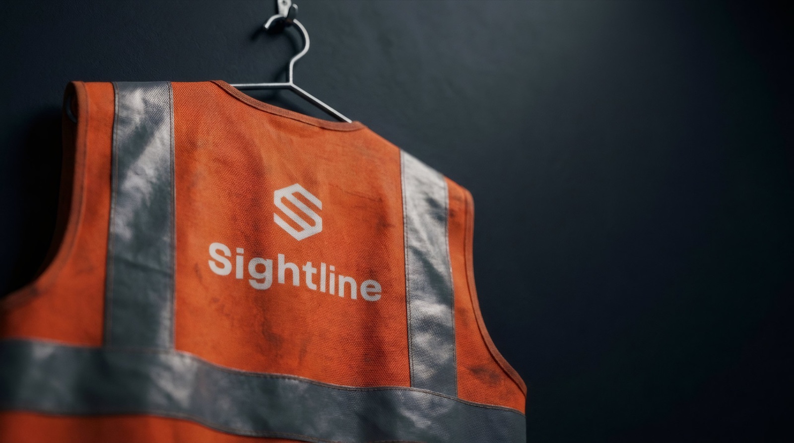
Reversed white Sightline lockup printed on a hi-vis orange safety vest hanging on a hookApparel · hi-vis vest
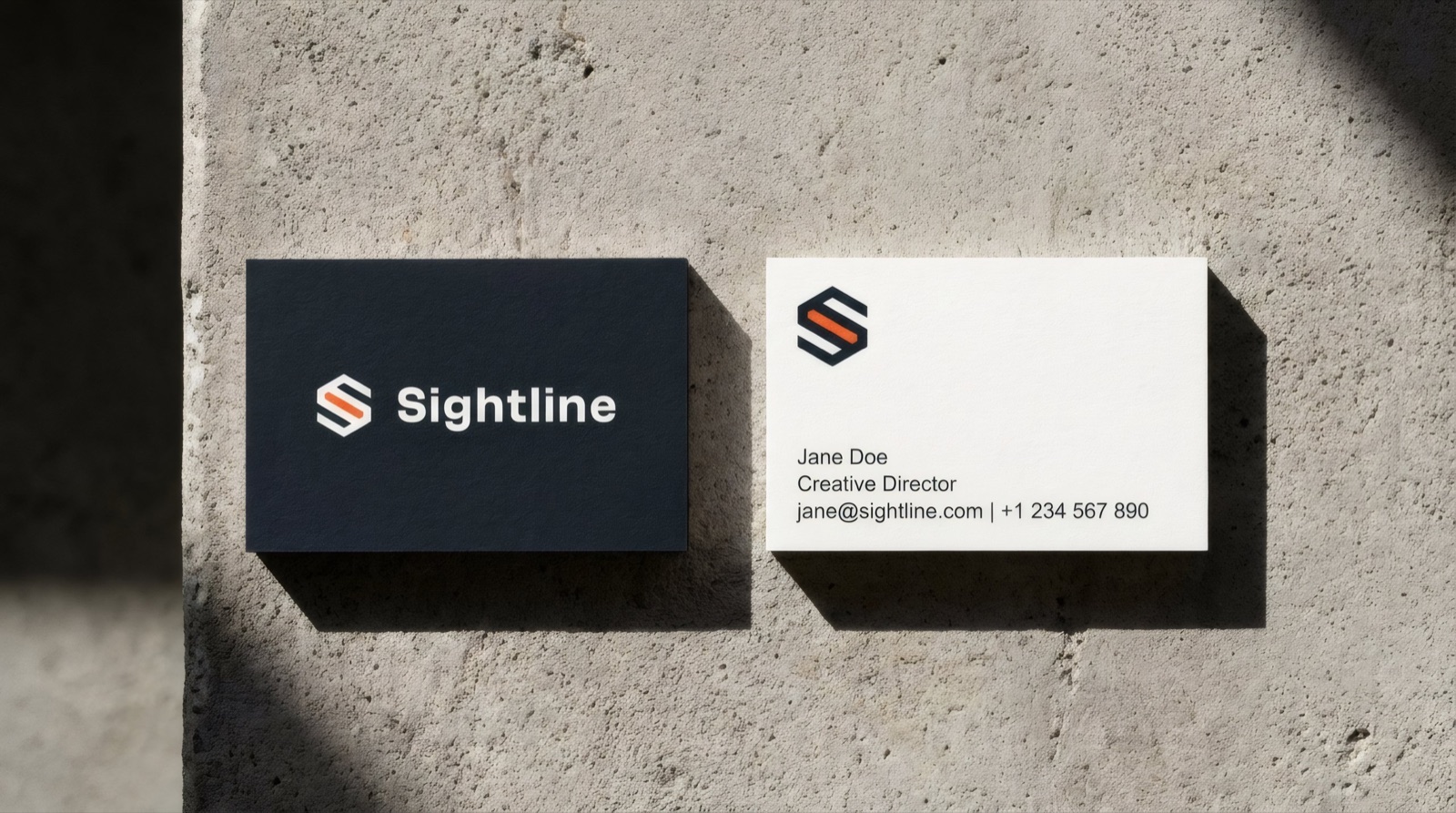
Two Sightline business cards on concrete — a graphite card with the lockup and a white card with contact detailsPrint · business cards
Out-of-home · transit
In the wild

The same system, at 60 miles an hour.

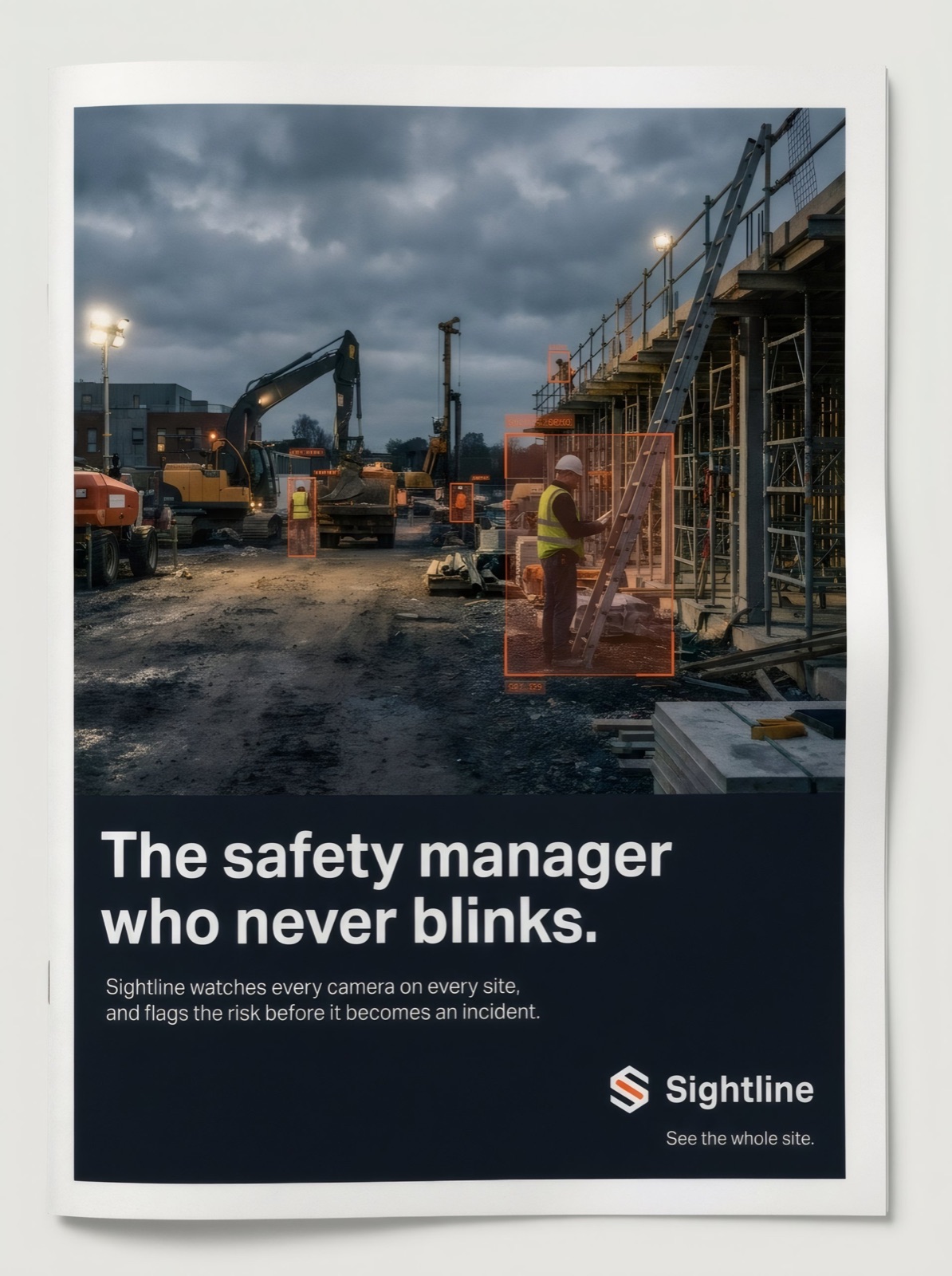
An identity earns its keep when it still reads on a highway, in a magazine gutter, and on a fence at dusk. The mark holds; the campaign line does the arguing.

Out-of-home · billboard
Full-page trade magazine ad with a jobsite photo and detection boxes, headline: the safety manager who never blinksPrint · trade press
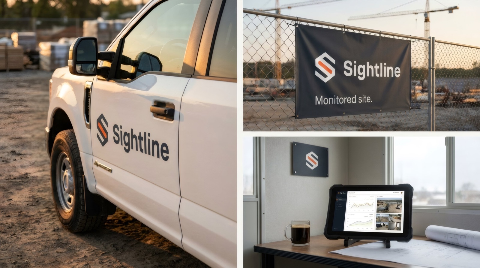
Sightline applied on-site — a white pickup truck door decal, a monitored-site fence banner, and an interior wall plaque above a dashboard tabletEnvironment · signage
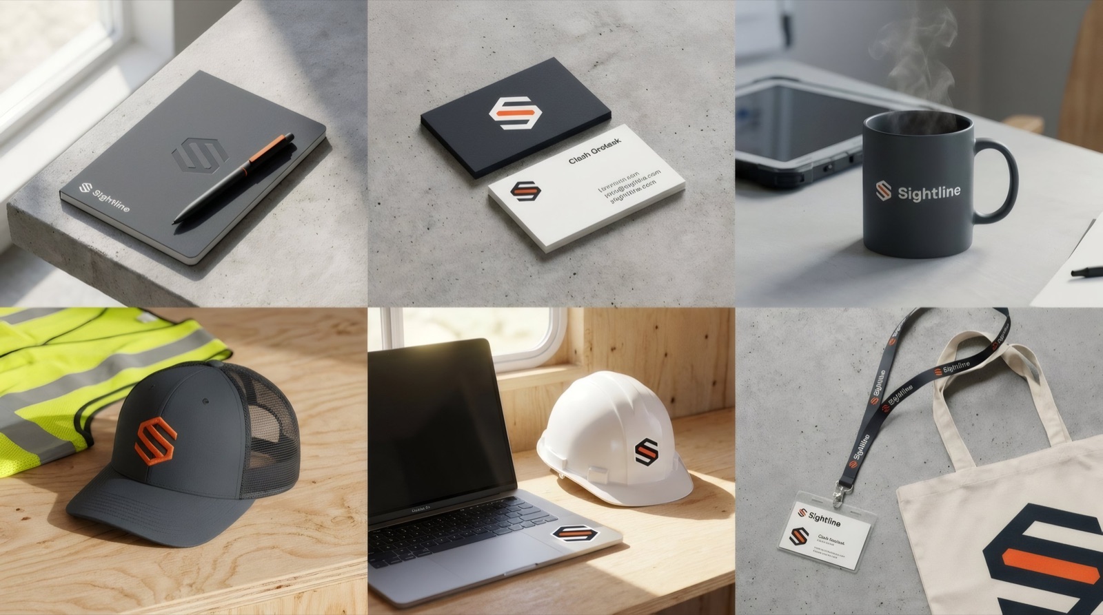
Sightline brand collateral laid out together — notebook, business cards, mug, cap, hard hat, hi-vis vest, lanyard and toteCollateral · the kit
The calls

What AI proposed, and what I did with it.

The model was a fast, tireless studio. It was not the art director. These are the four decisions that made the difference.

Proposed → decided

It kept drawing an eye. I threw them all out.

Every first-pass mark was an eyeball or a camera lens — the whole category's cliché. I pushed it toward a monogram instead, then made the call that gave it meaning: pull the S's middle stroke out as an orange sightline. Structure carries it; the color just points.

Proposed → decided

Safety-orange on black looked like caution tape.

The obvious field palette screamed hazard. I demoted the orange to a single focus accent on a calm graphite, so the brand reads as infrastructure you trust, not a cone you step around.

Proposed → decided

Thirty wordmarks. I used none of them.

The generated logotypes were busy — custom ligatures, a dot on the "i" shaped like a lens. I set it in one clean weight of Clash Grotesk instead. Restraint was the call the model wouldn't make on its own.

Proposed → decided

The tagline wanted to say "AI."

Drafts leaned on "AI-powered site intelligence." I cut it to See the whole site — the benefit in the user's words, with a double meaning that earns its place. The tech is the how, not the pitch.

Why it's here

From brief to built in a day — direction still by a person.

This is the shape of brand work now: the execution collapses from weeks to hours, and the value moves almost entirely to judgment, most of it in what gets rejected. Sightline is invented so I could show the whole arc in one piece: strategy, mark, system, and applications, with a clear trail of the decisions a director makes and a model can't. That's the part of the job I'm built for.

Sightline is a fictional brand created as a self-initiated concept. No company, product, or client is represented. Identity, copy, and mockups designed by Don Le with generative tools in the loop.

Next VIZIO →